


Create a simple loading icon with only HTML & CSS
For more loading icon examples, see loading.io, a website dedicated to many loading icon animations and styles
Why use a loading icon?
Sometimes, when building a webpage, you will need to load data or assets to the page that take longer than a split-second to load and render on the screen. In many cases where you can't hide that loading activity and have to let the user know to wait, it provides a good User Experience (UX) if you populate the page with a loading icon.
When there is a loading icon on screen, a user knows that the webpage hasn't just given up on loading/rendering something and they are willing to wait a little longer. Of course, it's important to implement things that will minimize the wait time, but while wait time is inevitable it's important to let the user know that their waiting is warranted.
When should I use a loading icon?
Appropriate use-cases for using a loading icon include asynchronous functions while waiting for functionality to be completed such as:
- Network requests
- Compiling/generating HTML from non-HTML content
- Reading data from a database
- Waiting on other triggers to be executed by other users/processes
How do I create a loading icon?
This method only uses HTML, CSS animations, and CSS styling. This makes it a lightweight solution with a lot of customization capabilities.
Copy the code here and paste it into your HTML content:
<div class="loading-icon">
    <div></div>
    <div></div>
    <div></div>
    <div></div>
</div>
This defines a container class, loading-icon and several child divs that we can style and animate to create the appearance of a spinning wheel. Each of those divs will be used to create a curved line that moves in a manner that creates the appearance of a circle.
For the CSS animation and styling, copy and paste the code into your style content:
/* This class is used to contain the actual spinning divs */
.loading-icon {
    display: inline-block;
    position: relative;
    width: 80px;
    height: 80px;
}

/* This styling will apply to all the child divs of the .loading-icon container */
/* If you want to make changes to the appearance of the spinning wheel, make the changes here */
/* (i.e. - change the wheel color or size) */
.loading-icon>div {
    box-sizing: border-box;
    display: block;
    position: absolute;
    width: 64px;
    height: 64px;
    margin: 8px;
    border: 8px solid #000;
    border-radius: 50%;
    animation: loading-icon 1.2s cubic-bezier(0.5, 0, 0.5, 1) infinite;
    border-color: #000 transparent transparent transparent;
}

/* This animation delay makes the first div in the container start first */
.loading-icon>div:nth-child(1) {
    animation-delay: -0.45s;
}

/* This animation delay makes the second div in the container start second */
.loading-icon>div:nth-child(2) {
    animation-delay: -0.3s;
}

/* This animation delay makes the third div in the container start third */
.loading-icon>div:nth-child(3) {
    animation-delay: -0.15s;
}

/* These animation definitions rotate the divs 360 degrees in a circle */
@keyframes loading-icon {
    0% {
        transform: rotate(0deg);
    }

    100% {
        transform: rotate(360deg);
    }
}
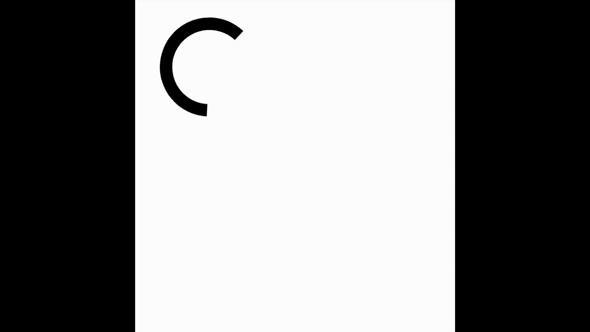
Altogether, this content will render a black spinning wheel for a loading icon. If you don't already have a file to put the loading icon onto, copy this full code snippet into a .html file and open it in a browser:
<!DOCTYPE html>
<html>

<head>
    <style>
        /* This class is used to contain the actual spinning divs */
        .loading-icon {
            display: inline-block;
            position: relaative;
            width: 80px;
            height: 80px;
        }

        /* This styling will apply to all the child divs of the .loading-icon container */
        /* If you want to make changes to the appearance of the spinning wheel, make the changes here */
        /* (i.e. - change the wheel color or size) */
        .loading-icon>div {
            box-sizing: border-box;
            display: block;
            position: absolute;
            width: 64px;
            height: 64px;
            margin: 8px;
            border: 8px solid #000;
            border-radius: 50%;
            animation: loading-icon 1.2s cubic-bezier(0.5, 0, 0.5, 1) infinite;
            border-color: #000 transparent transparent transparent;
        }

        /* This animation delay makes the first div in the container start first */
        .loading-icon>div:nth-child(1) {
            animation-delay: -0.45s;
        }

        /* This animation delay makes the second div in the container start second */
        .loading-icon>div:nth-child(2) {
            animation-delay: -0.3s;
        }

        /* This animation delay makes the third div in the container start third */
        .loading-icon>div:nth-child(3) {
            animation-delay: -0.15s;
        }

        /* These animation definitions rotate the divs 360 degrees in a circle */
        @keyframes loading-icon {
            0% {
                transform: rotate(0deg);
            }

            100% {
                transform: rotate(360deg);
            }
        }
    </style>
</head>

<body>
    <div class="loading-icon">
        <div></div>
        <div></div>
        <div></div>
        <div></div>
    </div>
</body>

</html>
This should populate an empty page with a spinning loading wheel. Here's what it will look like:
Outtro
Thanks for joining for this short tutorial on creating a simple, CSS/HTML-only loading icon! In future tutorials, I will give an example of using the icon as part of an asynchronous operation using async/await and promises.
Happy coding :)